Christopher Kane has 13 years behind him – part of the dynamic London fashion era that began around the millennium. This was the first show since the British designer completely separated from the Kering luxury group, which had previously been his support.

Jonathan Anderson is in the opposite position, working with the LVMH luxury group for Loewe, the Spanish brand to which he has brought his stylish fashion and his interest in art. That success feeds his own brand that included artefacts that appeared as art objects at his show.
Together, the two designers offer, out of London, a fresh take on 21st-century fashion.
https://www.instagram.com/p/B2fPqWxntjb/?utm_source=ig_embed&utm_campaign=dlfix
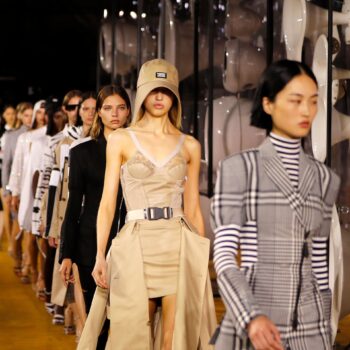
Christopher Kane’s Winning Ways
“More joy” read the T-shirt that Christopher Kane wore for his show. If I had not known that the notice was linked to the “Joy of Sex” subject of last season, I might have thought it was all about the merry flowers that appeared on digital boards on the walls of the venue – and on many of the clothes.

Or it could have been the designer’s pleasure at being untangled from the mighty Kering luxury group which had decided that the designer could not be fitted into their big brand aesthetic.
Kane has his own world and finds the words for it: “We started with the concept of fetish again, but obviously it is different from last season, which was really highly sexed. Whereas this is all about eco-sexual people.”

“Eco-sexual” – now that’s a new fashion phrase!
“It’s for those who are in love with the earth and with nature,” Kane announced. “I’ve always been, from the beginning, a huge fan of science and nature – so there are beautiful fabrics, prints and the florals from London Fields, which is my home.
“So it is all about the wheat flowers which people neglect, but I love. There were stars which I have done before, so it was dreamy and romantic – but it was also hard-edged for a rough, tough girl.”
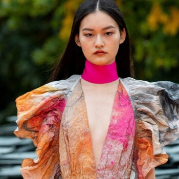
https://www.instagram.com/p/B2fOg-tHfHB/?utm_source=ig_embed&utm_campaign=dlfixTo “say it with flowers” has a very different perspective when Kane chooses a puff of a skirt, blown up as if the flowers on the short skirt were opening up. It appeared with a taut black jacket that tried to keep the body-conscious outfit under control. Or when an insert of fabric on a black chiffon dress offered a patch of sunset with a figure – gender unspecific – at the thigh line.

There was gender fluidity in tailored velvet jackets, but gender-specific for dresses that curved at the shoulders and again at the hips. Body-conscious was a big part of Kane’s language. His deliberate focus on sexuality included a bra top made in the designer’s squidgy product. Following the curve of the bosom on a white shirt looked highly sensual.
But the boldest step was to give a sexy strength to the flowers.

“We always try to do florals differently, so we didn’t want to make them pretty,” Kane explained. ”We did really sharp tailoring, not flounce – and this time we did paisley with frills. Paisley is something which is known for liberation, human equalities and something which means so much to different religions.
As usual, Kane is playing his fashion games – in which his originality is always a winner.
https://www.instagram.com/p/B2fPcTTHz-3/?utm_source=ig_embed&utm_campaign=dlfix
JW Anderson: Art At The Heart
Jonathan Anderson is a designer wedded to art. And the question each season is not whether he will exhibit some link with the art world, but who he will choose.

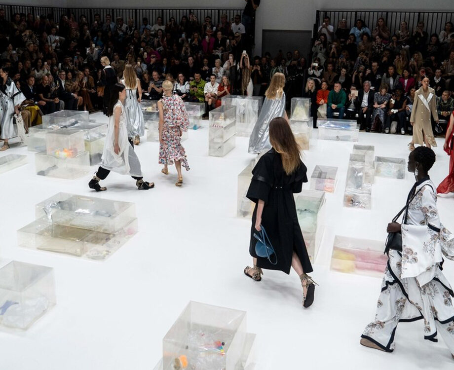
Around the square-shaped room were transparent boxes containing, apparently, the detritus of our messy world. These installations by Canadian installation artist Liz Magor were clearly a statement about toxic waste. Transparent Mylar material created cartons filled with rubbish made to look surprisingly graceful.

JW explained: “I saw her work in Harvard and I liked what she was trying to say – an experience about looking, how we perceive things, how we look at textures, how we see jewellery – and what it is.”
“I had done the Hepworth show,” he continued, referring to a previous show with a focus on art, which the designer said was about making fashion “re-focus”. The actuality was clothes which were “a bit exaggerated, a bit Marie Antoinette – and then they deflate.”

All this seemed like JW’s Irish gift of the gab, however heartfelt it was. For the clothes themselves did not look like ephemera, but rather in the modern spirit of re-cycling and pre-loved.

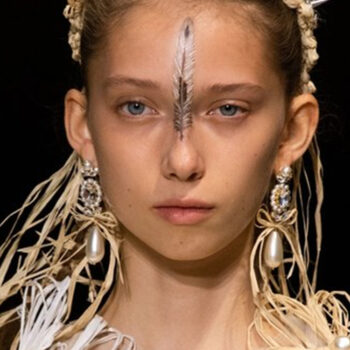
The artist’s big contribution was to put sparkles into the picture, using glitter to trace the figure. Think of diamanté circles around each breast, or the crystals as sparkling brasseries.

As so often with JW, his explanations turn out to be more complicated than what he shows on the runway. A dark dress with a twist of glitter across the breasts or a low-sparkle sweater breaking into a tufted skirt were hyper sophisticated – and never vulgar, in spite of the focus on bosoms.https://www.instagram.com/p/B2fOCWmnDjf/?utm_source=ig_embed&utm_campaign=dlfix
But why did women’s upper parts play such a pivotal role for the designer? In a revealing sentence, he brought to the fore what creativity is.
“I don’t know where it comes from – I was looking at the idea of the daisy and its iconography,” he explained.

“In the 60s and the 70s, this kind of image had this resurgence in print. I was looking at this idea of, if you remove the clothing, what is that? It’s about the sensuality, the pull and tug of it. I don’t think there’s an underlying message. For me, it’s just about looking. I think we sometimes want to have meaning in everything, but maybe we should just enjoy the idea of looking.”

An intriguing lesson from an interesting designer.